
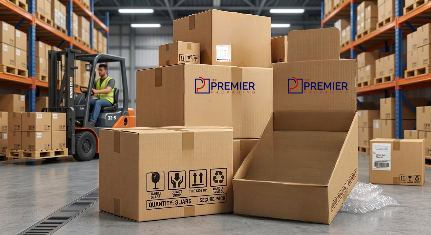

Here’s something most store owners don’t think about until it’s too late: the checkout counter is where many real buying decisions are made. Not the aisles. Not the shelves. The counter, in the last thirty seconds before someone pays and walks out. I’ve watched customers grab a pack of gum, a small skincare sample, or a chocolate bar right off a counter display almost without thinking, and that’s the whole point of these boxes existing in the first place.
So if you’re designing one, or getting one made for your product, it’s worth slowing down and actually thinking through the details. A rushed design can sit there for weeks and get ignored. A good one earns its shelf space back within days.
Why It’s Easy to Underestimate This Box
Brands will spend serious money on their main packaging glossy finishes, embossed logos, the works and then treat the cardboard counter display boxes as an afterthought, something the printer just “figures out.” That’s backwards, honestly. The display is doing the selling job when there’s no salesperson around to say a word. It has maybe a few seconds of someone’s attention. That’s not a lot of room for error.
Cardboard works well here for practical reasons too. It’s cheap to produce in bulk, it’s light enough that store staff won’t complain about setting it up, and it folds down flat for shipping, which retailers actually care about.
What Actually Makes One of These Boxes Work
I’ll be honest a lot of design tips articles online just repeat the same five points in different words. What actually matters comes down to a handful of practical things, and most of them have less to do with looking pretty and more to do with surviving a busy store environment.
Size matters more than people expect. Too tall and it blocks the cashier’s line of sight, which staff will notice and quietly move it. Too wide and it eats up counter space nobody wants to give up. Somewhere around 8 to 14 inches tall is the sweet spot for most products, though it really depends on what you’re selling.
Strength is the next thing people get wrong. A box that looks great in a design mockup can collapse after a week of customers picking things up and putting them back. If your product has any real weight to it, don’t cheap out on the flute thickness. It’s a small cost difference upfront and a big difference in how the display looks after two weeks in a real store.
Some practical things worth getting right:
- Keep branding to two, maybe three colors too many and it starts looking like a flyer, not a product display.
- Make sure your logo and product name are readable from a few feet away, not just up close.
- Cut a window into the box so people see the actual product, not just artwork of it.
- Skip anything that needs tools to assemble. Store staff will not thank you for a box that needs a box cutter and ten minutes.
- Design it to fold flat for shipping this quietly saves a surprising amount on freight.
Picking the Right Material
This part gets overlooked a lot, but the board type you choose changes almost everything how sturdy it feels in someone’s hand, how long it lasts on a counter, and honestly how much it costs to print at scale.
| Material Type | Best For | Durability | Cost Level | Typical Use Case |
| E-flute Corrugated | Lightweight snacks, cosmetics | Moderate | Low | Short promotional runs |
| B-flute Corrugated | Bottled items, small electronics | High | Medium | Standard retail counters |
| SBS Paperboard | Premium or luxury items | Moderate | Medium-High | Boutique and gift displays |
| Kraft Corrugated | Eco-friendly or organic brands | High | Medium | Sustainable product lines |
| Double-Wall Board | Heavy or bulk-packed items | Very High | High | Long-term or high-traffic use |
If you’re not sure which one fits, a decent rule of thumb: match the board strength to how long you actually expect the display to sit out, not how long you’d like it to last in a perfect world.
Color Does More Work Than People Give It Credit For
There’s a reason fast food chains lean on red and yellow, and skincare brands lean on soft greens and blues. Warm colors catch the eye fast good for food, snacks, anything meant to feel urgent or exciting. Cooler tones read as calmer and more trustworthy, which works better for health products or anything eco-branded. None of this is exact science, but it’s not nothing either. The main thing is consistency: if your counter display doesn’t visually match your actual product packaging, people’s brains take an extra beat to connect the two, and in a checkout line, you don’t have that extra beat to spare.
Mistakes That Keep Showing Up
A few things trip brands up over and over. Cramming too many product variants onto one small display so it looks cluttered instead of curated. Fonts that look fine on a laptop screen but disappear under harsh store lighting. Ignoring how much weight thin cardboard can actually hold before it starts to sag. And a surprisingly common one forgetting to leave any blank space for a price tag or promo sticker, so staff end up sticking it wherever fits, usually somewhere ugly.
A Word on Sustainability
This isn’t just a marketing checkbox anymore. Customers notice recyclable materials, and cardboard already has a head start compared to plastic displays. Switching to Kraft board or soy-based ink doesn’t usually add much cost, and it quietly signals that a brand’s thought about more than just the sale.
Final Words
At the end of the day, a counter display box is small, but it’s not minor. It has to hold up physically, look like it belongs with the brand, and convince someone in a few seconds to make a decision they weren’t necessarily planning to make. The brands that treat this box with the same care as their main packaging tend to see it pay off sometimes in ways that are hard to measure but easy to notice once you start paying attention to what’s actually selling at the register.
FAQs
What’s a good size for a countertop display box?
Most work well somewhere between 8 and 14 inches tall enough to be noticed, short enough not to block the counter or the cashier’s view.
How long does a cardboard display typically hold up?
With standard corrugated board, expect around four to eight weeks of regular handling. Double-wall board can stretch that out considerably longer.
Can I reuse the same display for different seasonal campaigns?
Yes, a lot of brands design a base structure once and just swap out a header card or wrap for each season, which saves on reprinting the whole thing.
Is cardboard sturdy enough for heavier items?
It can be, as long as you pick the right flute type. Double-wall corrugated is usually the safer choice for anything with real weight to it.
Are these displays actually eco-friendly, or is that just marketing? Genuinely, yes, for the most part. Cardboard recycles easily, and choosing Kraft material or water-based inks makes it even more so.